During the first wave of Covid-19, the UK government showed a chart plotting the country's mortalities against other high-income countries. They kept on showing it, until it revealed the UK to be the worst in Europe, at which point the slide disappeared. William Allen and Kristoffer Ahlstrom-Vij argue that visual comparisons are important ways by which politicians and media can change public perceptions
As the first wave of the pandemic swept around the world in early 2020, governments scrambled to protect their citizens. The range of measures they employed included social distancing, lockdowns, investing in testing, and vaccine development. Public health data became central to the crisis as it unfolded on screens and in media. In the UK, as in other countries, ministers went on national television almost every day to share the most recent statistics in charts and graphs.
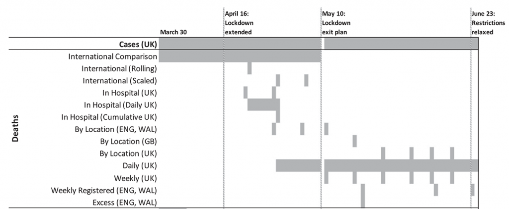
One of those charts tracked how the total number of Covid-19 deaths in the UK compared with other countries. For the first 40 briefings in a row, this chart occupied pride of place in the presentations. Sometimes it was one of only a handful of images. Although many people in the UK were indeed dying, the image showed how the country was still experiencing fewer deaths than elsewhere. Yet as mortalities grew to levels exceeding every other European country, this chart — which had appeared in every UK government briefing from 30 March to 9 May — was suddenly, and permanently, dropped.
The political significance of this wasn’t lost on opposition leader Sir Keir Starmer of the Labour Party:
When we did not have the highest number in Europe, the slides were used for comparison purposes, and as soon as we hit that unenviable place, they have been dropped
keir starmer, prime minister's questions, 13 May 2020
Starmer's message was clear: while the UK was now one of the worst in the world for Covid deaths, the decision to remove the chart was likely motivated by the belief that continuing to show it would make the government look especially bad in the public eye.
This belief has some basis in research on 'benchmarking'. This is the idea that voters pay attention to information about how their country is performing in a particular area compared with its peers. It was originally developed to explain how electorates rewarded or punished incumbents’ handling of the economy. The logic is that when voters see international benchmarks that reveal underperformance at home, it can come back to haunt the government in power — particularly on issues for which voters perceive the government to be responsible.
But was this likely the case for Covid-19, and for information conveyed visually that typifies how people encounter quantitative data nowadays? Was it politically shrewd, as Starmer implied, to remove the comparison chart from public view when it began to reveal an uncomfortable trend? We carried out a pre-registered study in July 2020 before the announcement of the successful Oxford-AstraZeneca vaccine trial. Our results suggest that, from a political point of view, removing the chart from presentations was indeed a wise move.
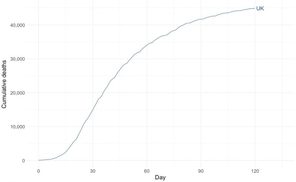
Using the most recent data at the time, we created the two charts below, which mimicked what the government and other news outlets had already published. The first shows cumulative deaths in the UK. The second is identical, except that it includes other European countries’ mortalities. Crucially, all these countries had — and continued to have — fewer deaths than the UK, even as they were successfully 'flattening the curve'.
Then, we showed 2,917 UK adults one of these images selected at random, or nothing at all (the control group). Finally, we asked respondents several questions about how they perceived different aspects of the government’s handling of the crisis to date. We then combined these into a single scale using Item Response Theory modelling.
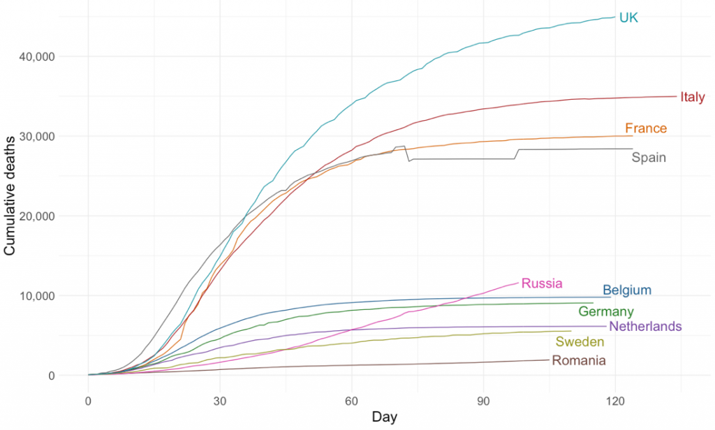
The main difference between the images was whether they included other countries for comparison. All the other countries had fewer total Covid-19 mortalities than the UK, but similar flattening trajectories.
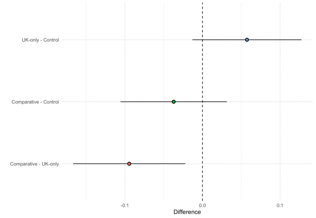
On average, respondents who saw the comparative chart expressed more negative views of the government’s pandemic management than those who saw the UK-only chart, as the third row of the plot below shows. The difference was about 0.1 of a standard deviation, a modest effect consistent with those found in other European countries. Moreover, given that respondents saw a single image, this effect size seems reasonable. We argue this is the clearest indication of benchmarking because the only difference between the images was the addition of other countries' cumulative mortalities.
It is important to note the UK-only chart did not generate more negative views compared with seeing no information (the first line of the plot). This went against our expectation that high numbers of deaths would reflect badly on the government whether comparisons were present or not. In fact, if anything, seeing this image may have caused more favourable perceptions, possibly because it highlighted how the UK had successfully flattened its curve. We are cautious, however, not to place too much weight on this interpretation.
Our main results show that in the case of Covid-19 in the UK, visual benchmarking was likely taking place to a modest degree. This lends support to the idea that international comparison is a valuable rhetorical and political tool for politicians not only to manage perceptions abroad, but to shape domestic opinion, too. More comparative data — and visualisations of that data — are increasingly becoming available and accessible to policymakers, journalists, and civil society actors. Using this data to benchmark governments' performances has the potential to change public opinion on more than just economic issues.